Saturday, 29 June 2013

CSI case file 78 - solved


This week I got to scrap my page right here at Debbi's house, how lucky am I?


This was the case file
And here is how I solved the case

Did you notice I got be Visiting detective this week!!!


For my testimony I used the he said she said prompt
For my evidence
Metal
Travel accent(geo tag)
Buckles
Something glossy(the 100% label)
Stickers
Buttons


In case you were wondering there is a little story to this layout. We went for breakfast and I ordered a pot of tea. It came with this lovely doily. Debbi asked the waiter if she could have a doily too (for scrapbooking purposes, of course). He brought two of them. We kept looking at these pretty lacy doilies. We wanted to ask for more but chickened out, so Debbi asked him who made them. Brooklace was the answer (Debbi and I ordered 100 from a party company to split). Anyway, we were outside the restaurant taking pictures and decided we needed to get a picture of those doilies. I am the Queen of Silly Pictures, so this is the result.

Toodle Pip x

Monday, 24 June 2013

July Sketchbook365

It's reveal time over at Sketchbook365


When I saw the sketch I instantly loved it, the big chevrons etc. When it came to scrapping it my layout went in a totally different direction and I ended up making those yummy big chevrons into small trianlges - go figure lol
 And here is my take on the sketch

This month we were sent some of the new basic grey collections to play with I chose Hipster as I loved the oranges and browns in the range, my pictures from a recent photoshoot with my youngest daughter matched perfectly and I kept the whole colour scheme to the brown/beige/orange tones

Hope you will check out all the stunning designs by the DT, a feast for your eyes!
Toodle pip x

Supplies used


Wednesday, 19 June 2013

PAGE DRAFTS 'BE BOLD' CHALLENGE!

Em is such a talented lady and I really wanted to squeeze this one in before my trip to the USA
 
 
Hello welcome to Page Drafts very first challenge!
This post is to say a huge big thank you to every single one of you for following Page Drafts and supporting my little page dedicated to sharing ideas in the hope to help kick start that mojo back into gear. 
Because of your support Page Drafts has almost reached 500 followers over on our FB page which is very exciting! So to celebrate I thought it would be fun to set a sketch challenge (funny that...he he) and offer some cool prizes to 3 fabulous winners.
This challenge is open to both traditional and digital scrapbookers and of course overseas participants are more than welcome to join in so tell your friends all about PD's. 
Okay so lets check out the
~CRITERIA~
-1- 
Create a project using the 'SKETCH' below as inspiration. 
You may rotate the sketch however you must stick as close to the sketch as possible. I will be looking for pages that show creative flair and a unique way to make the sketch your own with out digressing too much from the original design.


I rotated the sketch this way


And this is how it looks
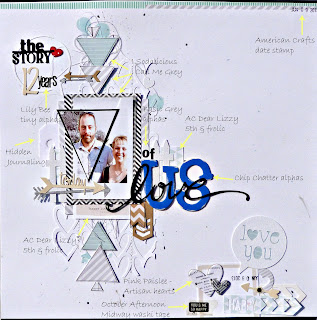
I had printed off this photo of us taken on our 12th wedding anniversary and originally was going to use them for another sketch. I printed off 2 and cut us each out in a triangle shape but then the one of me went missing(in fact it's still "missing") so I just joined them all back together so to speak!

When the challenge said bold I remembered these old chip chatter alphas by chipchatter.com
I loved the bright bold blue colour as well.
Then literally I just grabbed scraps from my little tub and went to town lol
I found the love title that I had cut previously for another project and layered it over the US word


I kept with the triangle theme and it represents the stripey piece down the centre of the sketch I used just a thin border outline of a speech bubble to hold this part of my title. I cut the heart shaped background on the cameo, and added my splattering and tangled thread behind it.


Spot the (not so) deliberate mistake!
Yes I stamped the date upside down lol it all adds to the charm right??

I hope I stuck to the sketch enough for you to still see it (I do often tend to get a bit carried away lol)
I have done another product list, I really like this idea and am going to try and do it for all my layouts, what do you think??

See you when I get back. . 
Toodle Pip x


Monday, 3 June 2013

Scrap around the world

Was very excited last month to see a new challenge blog launched Scrap Around The World run by my good friend Helen Tilbury
I didn't get chance to play for the first challenge, but as soon as I saw the June challenge I had an idea in my head.
This was the mood board and the sketch for this month

I loved the pastel colours and so looked for papers to match those first
I had some photo's taken in a studio last month and one of them was me holding a camera perfect for the theme


I mixed up some texture paste in what looked like the pale blue but in actual fact when it dried it has more of a greeny tinge to it but I went with it and I think it looks fine
I had found this quote on the Internet a long time ago and written it on a post it note that turned up when I was cleaning the craftroom - perfect timing
"A good Snapshot stops Memories from running away"


I turned the sketch on its side and followed it in my own interminable way
A few close ups

here you can see the colours of the texture paste better

I love the geo tag trend at the moment and used a large one as a frame doubling up for the "O" in the word Snapshot

I used my Cameo tons on this layout and I love how it can cut such fine detail such as this "Memories" word

Instead of writing up a product list (most of it was quite old stash) I saw this idea on someones blog the other day (apologies I can't remember whose blog it was) and thought it was a neat idea!


It will be a fairly quiet month for me as in 17 days time I am off to the US to visit with a scrappy friend for 10 yummy days! Whoop Whoop!

Toodle Pip x


Saturday, 1 June 2013

A quick share

I have a post up today on the Papermaze Blog
Just thought I would share with you

Along with the Echo Park papers this month I got sent a sheet of corrugated cardstock, I don't know about you but I just love the feel of this stuff! Is that weird? lol
I was going to use it as a base for the layout, but instead I used it to help pull just the blue colours from the papers with a small pop of red to draw the eye in.


 I simply stitched a spiral circle onto the middle of the layout and then cut the chevron paper into "arrows"
A little tip: I needed 4 P's for this layout and as I had already used 2 of the 4 that came on the sheet I cut the bottom loop from the B's to make my extra P's. Lots of different letters can be created from others if you run out of one you need
I used one of the little frames from this sheet of American Crafts 5 & Frolic for the photo mat
 
The Summer part of the title was cut from the 3 x 4 journaling card sheet, which I layered on top of a torn piece if the corrugated paper
For a final pop of interest I added a kraft tag onto which I wrote my journaling.
I really love this line of paper and how it looks quite different from This layout I made with the same collection
Hvae fun creating!